

The Challenge
Krispy Kreme, the global doughnut and coffee chain, needed a new UK website to help drive their brand forward, create excitement and engagement among visitors and deliver increased revenue through ecommerce. They needed a mobile-first, seamless end-to-end customer journey which would delight users and increase conversions for the business.
“We’re delighted to now be able to offer our customers the option to seamlessly purchase and receive our products. Our website is optimised, fast and user-friendly whilst providing an engaging environment for users to enjoy the brand. The results demonstrate the expertise of the team at Ridgeway.”– Adrian Mosley, Head of Digital, Krispy Kreme UK
The Strategy
Seamless Navigation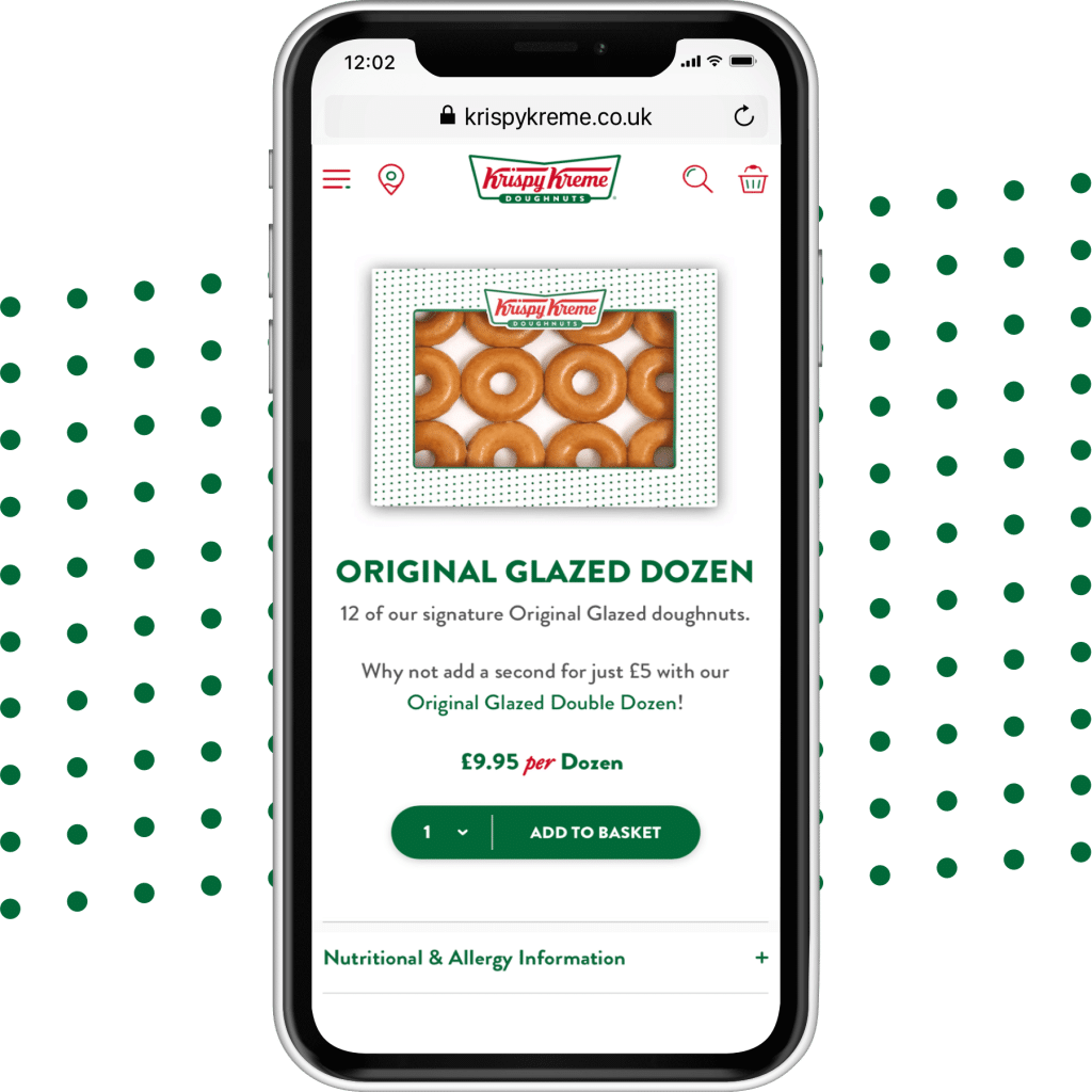

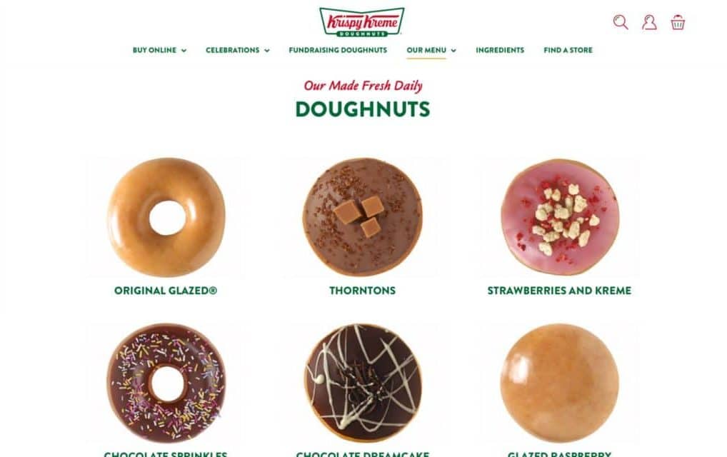
The previous Krispy Kreme website was difficult to navigate, and users would have to make multiple clicks to get to the desired content. On a mobile device this was even more difficult and with 82 per cent of visitors doing so on mobile this was a major barrier. The team at Ridgeway redesigned the whole sitemap so there are now fewer choices with a shallower structure. The page layouts were designed in a consistent way with best practice in mind to enable users to navigate the site easily. The pages have a clean design with clear page hierarchy and improved taxonomies with user-friendly labelling.
Throughout the site there are now upsell and cross-sell opportunities with clear calls-to-action and product recommendations to help increase range selling and average order value. Overall the improved navigation and user-friendly designs enable customers to easily complete the task they came for, whether informational or transactional.
Performance As A Priority
The old website consisted of large image files and unnecessary CSS and JavaScript, all of which was contributing to the slow load times on desktop and mobile. Improved performance was quickly identified as a priority. The site now has a performance score of 98/100 on desktop and 83/100 on mobile, both of which are under three seconds to first meaningful paint.
Fulfilment Suite
Krispy Kreme required not only a customer-facing website but a hub fulfilment suite for their production teams to fulfil orders efficiently. Kentico enabled Ridgeway to build a visually engaging site with a sophisticated suite of fulfilment applications to help team members transition orders through the fulfilment process.
The overall architecture of Kentico allowed Ridgeway’s development team to make use of the features provided in the Portal Engine to build custom modules and UI elements in the administrative area and to extend existing modules to provide the features needed. One challenge was the complex nature of the requirements which meant Ridgeway had to extend Kentico’s out-of-the box functionality to allow multiple shipping consignments per order, based upon product types.
Choose Your Own Dozen
Choose your own dozen is a key and unique feature of the website. It allows customers to select which 12 doughnuts they want in their box ready to collect in store or for delivery. This feature is simple and intuitive to use with a ‘mini-basket’ that sticks to the foot of the screen allowing the users to pick and mix their perfect dozen before adding to their basket.
In the four-month period post-launch there have been 2,727 purchases of the ‘choose our own dozen’, accounting for 29 per cent of all transactions.
Streamlined Checkout
The existing website had an incredibly clunky check-out process with separate processes for different types of orders from doughnuts to gift cards to wedding towers. They all consisted of a high number of unique steps, were difficult to navigate and unnecessarily complex.
Sign-posting was poor and, in some cases, it was unclear that the user was about to be funnelled into a payment process. The website was not optimised for mobile and was incredibly difficult to place an order. It was not surprising that a high percentage of shopping carts were abandoned, both on mobile and desktop, as users gave up in frustration.
Ridgeway streamlined the entire site structure, simplifying the user journey and enabling users to add all product types to a single basket. The site can now apply multi-tiered discounts, dynamic pricing and delivery. Users are now able to purchase products from homepage to completion in up to 50 per cent fewer clicks and for account customers they can make a purchase in just two steps. The confirmation page promotes the benefits of creating a user login, tracking the order and faster checkout, without adding friction to the checkout process.
The Results
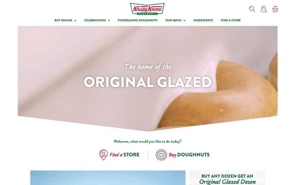
The Krispy Kreme website now provides a seamless and engaging doughnut shopping experience for both desktop and mobile which is easy to navigate, with quicker load times and a streamlined order process.
Comparing the three-month period after launch (26/11/18-26/2/19) with the same period the previous year, the new website achieved:
- 90 per cent increase in conversions
- 58 per cent increase in page views
- 43 per cent decrease in bounce rate
Conversions are up 90 per cent with 0.61 per cent of visitors going on to make a transaction compared with 0.32 per cent previously.
Page views are up 58 per cent and the bounce rate has dropped to 28.23 per cent compared to 49.73 per cent indicating a much higher level of engagement when users land on the site and the average page load time has halved.
The website now consists of 334 mobile pages compared to just 101 previously and the index coverage is now 327 compared to 125 before launch.
The original case study can be viewed here.